Thursday, 27 October 2011

Draft Music Video


Things To Consider When Watching :-

  • It starts off a few seconds into the song because for some reason it wouldn't let me change the starting point of rendering from the 125th frame. No idea why, we'll sort it out before the final version.
  • The black gaps are footage that either wasn't able to be shot (because we left it too late), was lost on the camera somehow, or was left out because we didn't find an appropriate place for it.
  • It's only two minutes because it turns out the footage we did shoot wasn't enough to fill the gap without looking like we just shoved the clips in, so two minutes was enough reallly, considering...
  • We're rewriting the music video to have an extremely small amount of narrative stuff and keep mainly to performance, due to the much easier to control area when shooting indoors and a lot of problems came when we tried getting too many people involved - just using the band would be much easier, and comparing the film shoot on Tuesday and Wednesday it's obvious that the band stuff can be done a lot better and quicker, and during school time.
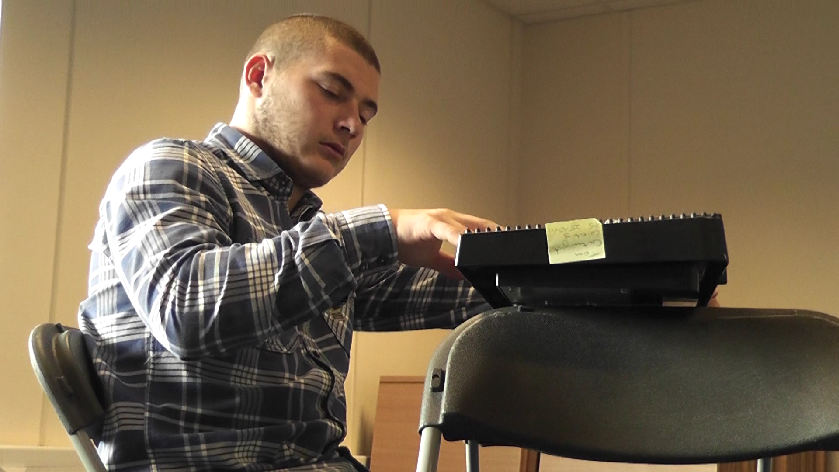
  • Visual problems, like tears in the image and flickering occasionally, etcetera. have been due to the compression settings we were using. For some reason we can't figure out how to do it, but seeing as we really didn't have much problems doing this before it's probably due to the file types we were using - we'll make sure to convert the .MTS files to .AVI files for the final version. It's good we caught this early.

Filming 2 #

The filming on Tuesday went well we got some good shots in except the amount of them we got done, it was only half of the  video in the first place, with the other part being a story at a park but we have decided to scrap that idea all together. And what we are doing know is most of the video being a band performance but with some photos telling a story. We thought we would do it this way because it makes the filming and editing easier and quicker.


.

Tuesday, 25 October 2011

Filming - Day #1


Today we filmed the first half of the music video, which involved the band in the E-Learning Centre. We did plan to have them wearing more formal clothing, but I thought the clothing they were already in was appropriate, especially in order to save time in the short time we had to film it during last lesson.


We did different shots of the vocals, the guitar, the keyboard and bass, but we think we probably didn't shoot enough. Thinking back to the storyboard, we should have done various versions of the different shots for repeated use, and now will probably have to compensate with more use of narrative shots for the draft. The planning wasn't very good, and we'll definitely make sure to improve that for the final cut (for which we plan to reshoot the vast majority of the video).

Filming Preparation 1#

We have just booked the e-learning centre for tomorrow 5th period; we have to turn up in costume which is shirt and trousers, I also had to bring in a keyboard because that is the instrument I am having to play, which meant bringing it to school on the bus and putting it somewhere until last lesson.


Monday, 24 October 2011


This is my draft advert for my album cover; it didn’t take that long except for putting the two guitars behind the key board and blacking them out by hand with the brush. Then after that all I and to do was put dates and ratings on it.


But the symbol is the instrument’s the band members are using, so I thought it would fill in some space when I first did it and ended up really liking it so I put it on the digipak as well.

Problem #1


Last week we were going to film, but at the last minute something came up with a couple of the actors and we were forced to reschedule to this week. Probably our own fault really, we shouldn't have left it so late to start filming and now we're going to have to cram it into this week. We also left it a bit too late to sort out the outfits for the band, so we're getting a basically formal outfit on them and filming the shots for the draft, but then we plan of reshooting them later on for the final draft so that we have time to sort it out.

Friday, 14 October 2011

Digipak and Magazine Advert Draft

Magazine Advert Draft
This magazine advert was made fairly quickly by taking a picture of a painting in my room and just adding some text to it. I wanted to keep with the use of a painting, the same theme as the digipak draft (below). I really need to figure out what colour scheme I'm going to be using for it (bit difficult), and then the final photograph and text and the like will definitely stick to it. The lighting will also be better on the photograph, and the layout of the entire thing will be sorted out. As it stands, the picture is dark and blurry and I've no idea exactly what colours I used in the painting nor what's in this photograph.


Digipak Draft
With the digipak design, because of the terrible, terrible lighting in the photographs making them come out clearly too dark for my original design, I decided to go with a style similar to the one used on Biffy Clyro's digipak for Revolutions, found here. On the cover itself there's a couple of photographs to keep it a bit interesting, whilst the inside of the cover is the same photograph as the advert. The contents page is similar to the original design I had for the contents page, except it's darker (and is actually the reason I switched to a darker design for this). At the moment, I've left out a lot of information from the bottom of the back cover, as well as the left cover and the back inside, which will obviously need to be sorted before I hand in the final digipak. 

Thursday, 13 October 2011


  This is the band in different poses for the album cover, which on my mock of it is just some random people but for the real thing i will have the band in one of these poses.however thing can change in the moment, so nothing is for sure yet.

Wednesday, 12 October 2011

Digipack


This is most likely going to be my Digipack with maybe some more bits in it because i think it looks a little bit plain but i will have to ask Ford or Hammond for their opinion.
I have copied the idea off Linkin Parks album Minutes to Midnight, I did it because it’s not too hard and I like the look of the cover. But the thing I will change is the band members will be from are band; might be in different positions and will have the instruments either being held by them or just being close to them.

Magazine Analysis


Image & Typography
This is a magazine advert done by Santogold. The image looks like a very heavy natural colour, which give me the impression that they play quite sort music. The picture in the middle are two black women looking at each other but they have their eyes cut out and the background of the cover fills in as their eyes, which are now leafs. The background is darker than the front of the cover making it stand out more and being able to catch your eye.
The writing is very different than a lot of other magazine adverts I have seen, what they have done is cut “Santo gold” and “Lights out”, which I think is very creative and goes in well with the women and their eye cut out. By doing this it makes them stand out more and it draws your eyes to it, which I what you want when advertising.
Layout           
The layout is quite simple with the picture being in the middle, band name at the top and the album name at the bottom. But as always the have put the band name at the top because it’s the most important thing on the advert, and the album name the second so they have made that stand out a lot as well.
Although it being simple it works well with background because its eye catching and makes the band and album name stand out.
Colour Scheme
The colours used are strange because the background is green and the lettering is cream, and you wouldn’t really want them going together because they don’t match each other. But I think the reason for the green background I to make the lettering stand out more than normal.


Although I think it doesn’t look great, it does make the fonts stand out and because it’s so strange it would turn people head, so in a way it’s good but I wouldn’t do it for my magazine advert.

Magazine Analysis

MotorHead


Image & Typography
This is a Magazine advert done Motorhead an America rock band. The image of the advert is the main singer of the band pointing right at the camera, which also looks like he is pointing at the public to try and get the attention. His eyes look evil at the same time, like he is possessed by something that is controlling him, which relates to their music because its heavy metal and that can be seen as the devils music. The font on it in is big and noticeable in white because it’s in front so it stands out even more. It even has a picture of the album cover on the advert so you know what it looks like when or if you go to buy it, making life much more easier for you.
Layout
The layout of the advert is with him in the middle and covering most of the page, with all of the advertisement about the album is all around his face, so you can still see the main bit of the picture. The band name is the easiest thing to see on the page because they want you to see what it going on about straight the way. As your eye gets draw to his face you then should look straight at the writing next to his face so it must be important info.
Colour Scheme
Doesn’t really have a lot of colour on the advert because it’s just him and the background. But they do use dark colours for him because rock & roll is not bright happy colours, it’s more like dark angry music.

Magazine Analysis

Cockney Rejects


Image & Typography
The image of this magazine advert of the cockney rejects is quite plain but I do think the look of the whole thing, with the writing being wonky and overlapping in some places. Its lacks some colour but that’s because it’s quite an old band and were more popular 20 years ago rather than know. The picture is very clear what it is going to have in the magazine and how much it will cost also where to purchase it. I do like the writing and the whole type writer look they were going for, it suit the black and white colours scheme they have gone for.
Layout
It’s a very basic layout and nothing out of the ordinary like you would get know days but it goes well I think with the music they play, for me it gives off the vibe that they haven’t put as much effort into it because of the plainness of it however that what punks were meant to be aloof and no being scared to be different and what people think. So they have related it will to their music and what they represent.
They have put the picture in the middle of the advert to catch the eye of the public, which will get people’s attention just because it’s their greatest hits. As always on any advertisement the title is at the top to make sure they know what the advert is about. It even gives you specifics on where to get the album in the bottom left corner of it.
Colour Scheme
The colour scheme on this is like what I said early is just black and white with black used more in the advert. To me it looks like they have gone for the newspaper look to try keep it old fashioned. It looks like they have cut the words out of something to get the collage look which is a thing they have done on some of their album covers but have added colour onto them.


Tuesday, 11 October 2011


Image & Typography
The image of this album cover is the Linkin Park band in a kind of deserted landscape. But what they have done is made he band and the name of the band all black, so they stand out, but the floor seems to fade away quite quickly which give it the effect of it being foggy.
Layout
The layout of the cover is the band at the front, which looks like they are standing on a wall but I’m not sure, but they have layout the entire band across the bottom of the cover.
Colour Scheme
The colour scheme is simply just black and white, with the band being completely black and the background being white to make the whole band stand out.

Types of shots used
The shots they have used are a long shot to make sure they got the entire band into it with neither of them being the main attraction.

Friday, 7 October 2011


Image & Typography
The album cover is done by Biggie Smalls how is dressed as an undertaker, which is a person that brings dead bodies to the funeral, the album is called Life after Death which is why there is a funeral car on the front cover as wells as a undertaker. But the main reason for the album name is because it was released after he died which is why it’s called life after death. And you can tell he is talking about himself because the license plate has his name on it. The last thing is that the curtains are still open which I think they are trying to get the idea of that he’s still alive through his music.
Layout
The layout of it is just a funeral car cover most of the digipack with Biggie Smalls leaning on the car, looking like an undertaker. The album name is on the back of the car, the name of the mean that he’s still alive through his music after he died.
Types of shots used
The shot is kind of a mid-shot but taken from an sidewise angle.
Colour Scheme
 The colours are very dark because it’s representing a funeral so. There red fire in the writing I think represents that he know he is going to hell.

I think my overall opinion of this cover is that they have got a lot of meaning behind it involving his death, and they have related that into the cover well so I think it’s a good album cover.

The Lettering Ideas

We three fools

We Three Fools

We Three Fools

We Three Fools

We Three Fools
WE THREE FOOLS


Album Analysis


Image & Typography
This is quite a strange album cover by Gnarls Barkley. The image of this by Gnarls Barkley is a mushroom cloud and at the top of it is lots of random things; this is in relation to the album name ST. ELSEWHERE. So when they named the album I think they thought they would try and do something completely irrelevant. The background of the cover it just white to make the picture stand out to get peoples attention.
Layout
There is not a lot to the layout of this album cover but only that they have put it in the middle of the cover to show that’s where they want your attention to be. They have the artists name in the top left hand corner because they wanted for the picture to have the main attention and the album name is on a separate line and not sure if they meant to do it but right next to the album name they have put a don’t walk sign which relates to ST. Elsewhere. I also think they want you to think that it is quite dangerous; they have a panther and a gas mask which dangerous symbols.

Colour Scheme
Not really a colour scheme in this, just that they have lot’s of different colours but mostly purple and bits of yellow and red to make it eye catching.

On the whole I think this album cover has done well on being able to catch them buyers attention with a very strange picture and lots different colour schemes used. But they have used some relevance to the album name with the picture having a big city in the fare part of the picture.

Thursday, 6 October 2011

Mockup Album Cover #2 (Dale)

Magazine Advert Analysis
Santogold


Image & Typography

The image used here is presumably of the band 'Santogold', surrounded by cut-out letters spelling the name of the band as well as the name of their new single, 'Lights Out'. The image itself is also presented as a cutout photograph with the same material used as the text, linking them both together and giving the thing the same feel as a hastily done collage.

The background is a lot darker than the dominating pictures and text of the page, making them stand out a lot and I guess help towards drawing the reader's attention when they're skimming over it. What I like about it is that it kept the actual amount of text to a minimum compared to the others I've looked at - whilst they had a big block of text talking about their single, the text on this is kept to the bare minimum and then just gives a link to their MySpace page.


Layout

Like the others, this advert has seperated the page into the top two thirds being the main draw, and the bottom third being the information. The top section is just the arist name and the picture they've chosen to associate with the single, and the bottom section is where all the actual information is at, which seems to be a very common layout now that I think about it... It makes sense, it seems like the simplest and easiest one to work with whilst still retaining a nice result. Unless you're Laura Marling.


Colour Scheme

The colour scheme on this, very much like the Laura Marling magazine advertisement is, is kept very natural. The dark, flower filled background on top of which is just a dark-paper-ish colour (for the paper, obviously), with the only unnatural thing on the page being the white text of the information along the bottom, but even that fits very well amongst the others, contrasting them just enough to get attention whilst not being distracting or discomforting to look at.

Overall, this advert works very well. The colour scheme and the layout choice are good, and the only thing I have a problem with is the use of paper cut-out for the artist name and album name, but that's more a personal opinion rather than saying it doesn't work.

Magazine Advert Analysis
The Verve


Image & Typography

The image here is mainly there to take up the background, with the foreground and majority of the reader's attention being drawn to the title of the band and album within basically the center of the page and the extra information being placed along the bottom.

The album's name itself has a very unique font to it, which I'm assuming has kind of been there thing, but it's only just unique enough to add a level of interest to it whilst keeping it just as readable as the normal font used everywhere else on the page - which is a good thing. With the album name and artist name contrasting so well along the light background and the "extra information" not really standing out at all, it's obvious the album name is the main draw of it.


Layout

The image takes up the entire background, with the page being split into two main sections - the bottom third of the image, which has a variety of dark clouds along with the extra information on the single, and the top two thirds that consists of the image, album name and artist name.

It's a very simple layout, but the background adds a lot of interest to the foreground objects just by being there, and it works really well in my opinion.


Colour Scheme

The colours used are fairly dull, natural colours that would be incredibly flat and lifeless on it if it didn't have that small flare of what I think is red/orange seperating the bottom third from the top two thirds. It's not enough to be the most interesting part of the page, nor large enough to have any importance as far as I can tell, but it is enough to draw the attention of people flicking through a magazine and give the background an added layer of interest.

The simplicity of the entire advert works incredibly well, especially compared to Laura Marling's (below).

Magazine Advert Analysis
Laura Marling


Image & Typography

The image used is fairly nice, and I'll assume it's the album cover. The fact that it looks drawn gives it a very natural feel to it, but at the same time it has this feel to it that it's not the most professional picture you'd ever come across, but maybe that's just me.

The typography of the artist name is also fairly smooth and looks like handwriting, again adding to the natural feeling of the page, and the contrast it'd no doubt have to a magazine like NME would definitely grab someone's attention,  but at the same time it makes it look very wrong and it just doesn't look nice.


Layout

This advertisement has managed to fill a whole two thirds of the entire page with the image of the album, something no doubt done in order to grab the attention of the person flipping through the magazine. The last bottom third of the page is just a big block of information on the album as well as the artist name above it all.

While I like the fact that it's tried to grab the reader's attention, the block of text along the bottom is fairly unappealing - with a whole magazine worth of text to read, why would someone stop on a page about a band they don't know just to read about an album?


Colour Scheme

The colour scheme used is fairly minimalistic, having only two prominent colours (excluding the colour of the outline) of green and red, which again adds to the natural feel of the page which is no doubt reflecting the artist. It just doesn't look good to me though.

I understand that they've tried to keep the colours minimalistic, but really they've made the page so overly simple anyway that it just looks almost childish, even with the intricacy of the leaves and whatnot. You could say it looks old instead, like a book illustration, but I get put off that idea completely with the text along the bottom.

I really don't like this advert.

Wednesday, 5 October 2011

Band Website Analysis
La Roux

Click here to go to the website...

The La Roux website, like James Blake's, is fairly simple - on the front page, it has the artist's name in big letters along the top and a big ol' picture of the singer on the right. What I've always found a bit odd about La Roux's presentation is that all advertisements and portrayals of the band focus so strongly on the singer Elly Jackson that the co-writer Ben Langmaid is completely ignored, and it's the same really with the website.

On the front page there's an automatic popup of a music video, but it's easy to close and completely ignore, unlike the James Blake site. The front page also has La Roux's Twitter feed directly on it, as well as links along the top of the page for social networking purposes. What I like about this site is that, along with the usual links to news, discography, videos, images, merchandise, etcetera. it also has a link to a biography, which I think would really appeal to people who stumble across the site rather than doing what James Blake and Biffy Clyro did, which was to appeal almost solely to people who are already fans.

It also does a pretty great job of connecting the audience to the band through the social networking aspect, especially by having the news feed be a direct view of their Twitter and allowing the user to reply once they've signed in. Interactivity on a site, especially a band site, really helps to keep the audience's interest - which is obviously something you'd be aiming to do.

Band Website Analysis
James Blake

Click here to go to the website...

This is one of those websites you find that has very, very little actually on it, at least on the homepage. As soon as you go on, the music video for Lindesfarne loads and plays in the background, and beyond that the only stuff that's on it is the artist's name (James Blake), a button to change the video displayed, a link to his music, social networking sites and an online store presumably to sell his albums and merchandise on.

Like the site for Biffy Clyro, the site has the main goal of having the audience thinking of nothing but James Blake whilst they're on the site. As soon as you go on it it's just in your face with the music. There's not really much else to say about it, other than it contains the normal stuff you see on band websites nowadays - music, a list of their latest live performances, social networking sites and a merchandise store.

One of the bad things about the site is that it sacrifices ease of access just to shove a music video in your face - it's not immediately obvious what the links on the site actually go to ('Music' sure, but 'Live' and 'Friends' aren't obvious at all), and the fact that the entire site is accessible only via the Adobe Flash Player actually restricts some people from going on it (even if it is basically installed by everyone nowadays).

Band Website Analysis
Biffy Clyro

Click here to go to the website...

On the front page of the website there's a largefocus on the band's image - the name dominates the header of the page, and the first large news article is an advertisement of their latest album release. There's also a video right next to the news area of them at a concert, below which is a link to their Twitter page and a music player for one of their songs.

Overall, the general focus of the site is on the band - which seems kind of obvious, but it's sort an "in-your-face-everywhere-you-look" kind of focus, not just the usual kind you see on other websites with specific topics. For example, the background itself is changeable on this site between 6 different background images, and 5 of them are of the band, all of which make sure that at least one of the band members (mainly the front man, Simon) is clearly visible on the layout whilst the others remain obstructed. Just look at the image above to see an example of that.

There's a big focus on social networking too, what with the Facebook subscription sign up on the left and the Twitter link on the right. All of the features of the site really add up to try and connect the band to the audience in some way, making the audience feel like they're almost friends with the band. Not a bad way to immerse them.

Tuesday, 4 October 2011

Album Cover Analysis
'The Shade of Poison Trees' by Dashboard Confessional


Image & Typography

Just like the other album cover's I've seen that have caught my eye, this album has a single image within the center (this time of a disintegrating apple) along with the name of the artist and the album. What interested me about this though is that they've got so much space on the cover to put the title and image and whatnot, a move that was no doubt done to attract the audience with the image itself and instantly get them reading the name of the band and the album name.

Layout

The layout of the album is fairly simple. The majority of the content (image and text) is in the center, and the only other thing besides the orange (?) background is the dirty white outline to the background that helps to frame the content on the cover very nicely. On all the album covers I've looked at so far, I definitely prefer those that have framed themselves properly (unlike 'Boys Like Girls', which just seemed ruined by the background to me), and this does it pretty well.

Colour Scheme

This cover seems to have gone for the minimalistic route when it comes to a colour scheme, in that there are only three colours on the entire thing: dirty white, for the border and band name; orange (?), for the album name and background; and red, for the picture of the apple.

The fact that they decided to use a selection of colours that makes it all easy on the eyes was great and all, but the most interesting thing about it in my opinion is the choice of colour for the apple. The two out of the three colours on the cover are shared amongst two different elements each, but the red is saved specifically for the image and is the one that stands out the most, being fairly dark in comparison to the others. It helps massively with drawing the customer's attention to it, and thus the band name and album name.

I don't often have much appreciation for colour, being colour blind, but this has stood out as one of the nicest albums to look at if only for it's use of colour.

Album Cover Analysis
'Boys Like Girls' by Boys Like Girls


Image & Typography

Again, as with 'The Mouse and the Mask' by Danger Doom, this album has a very simplistic image and typography that works well for it. The title itself is a simple and plain font that actually leaves no spaces between the words of the artist's name but instead chooses to differentiate them by make the middle word unbolded. The image is of a cloud dripping what appears to be different colours onto a rectangle - at least I think that's what it is, but it could also be something completely different. The layers of colours work well for it, considering they make it stand out completely from the background, but I'm not entirely sure how the picture relates to the album, unless it's to do with one of the songs. It's very abstract.

The background itself tries to frame the whole thing by making it a gradient that darkens around the edges, but I don't think it really works because of how little difference there is between the colours being faded between.

Layout

Again like Danger Doom's album, this album simply consists of the artist's name (which is also the name of the album) above an image, but the simplicity of it works pretty well to attract your attention to it. I'd say one of the main problems with it though is that it doesn't look unique enough. Thought I've not seen an image quite like this, the general style it's gone for is something I've seen countless times and just wouldn't attract me to pick up the album if I saw it.

Colour Scheme

The colour scheme, in my opinion, was fairly well chosen. The variety of colours in the logo image really attract the attention to it, especially compared to the background and artist name, but really the plain, dull colours of the background and title put me off a lot from this. Looking at the first mockup album cover I made, I can tell that's probably one of the biggest problems to do with that too, and should probably go a background that really frames the cover properly.

Album Cover Analysis
'The Mouse And The Mask' by Danger Doom


Image & Typography

The album is called 'The Mouse and the Mask', but rather than having the title on the cover they've opted to have the image itself be the title - a mouse in a mask/helmet, resembling a skull and crossed bones. What works well about this is that the image itself is very interesting, and the main point of focus on the cover, and it's actually fairly simple - it's just a mouse in a mask with a paper-like background and the artist's name. The font used for the title also helps to make it seem like it's printed onto the background, with a traditional stencil-like font used.

Nothing complex needed, it works great already.

Layout

Having the image centered and being the main point of focus is appropriate, because of it being the replacement of a title, and the artist's name laying just over the image works well to let people know who the artist is. The edges of the paper-esque background also help the frame the whole thing rather than letting it trail off, which helps to make it seem a lot more professional.

Colour Scheme

The colours used help to seperate the title and artwork from the background fairly well, with the background itself having a beige-ish look to it that makes it obvious it's meant to be a piece of paper or some other similar material, and the texture of that background seems to be over the image and title as well (if faintly) to make them all seem like a single piece of paper as opposed to images placed on top of each other. None of the colours really stand out, but the fact that all of them don't stand out it a very flat - in a good way - image to look at that's easy on the eyes.

Storyboard
Attempt Numero Uno


The storyboard, though not exactly what we've got in mind for the final video, has the basic elements to it. When trying to put it into the form of an animatic we found that the shots we had planned were just too fast, so what we're going to do instead is script and plan the two shoots, shoot them normally in as many ways as we can, and then potentially improvise to some extent in post-production whilst sticking to the storyboard as a general guideline rather than a blueprint.

The animatic itself will be improvised from the shots that we've drawn down, and will be closer to the final product than we have written down.

Oh yeah, and sorry for being a couple days late, it's Dale's fault.

Inspiration For Digipack


The first four of the album covers are ones that I like and have thought about for ideas for my final digipack but the last on is the one that I want to focus it on. This is because I want a rocket on the front cover of the album to link with the lyrics in are song “build a rocket boy”. But I want the rocket to be bluer and less red, in a up right position. This is what I want my rocket to look like…


Monday, 3 October 2011

Mockup Album Cover #1 ( Dale )


For this mockup I went for a colour scheme of three main colours (red, green and blue) and used a free set of photoshop brushes in order to create a face made out of watercolours, to go along with the album name 'Childhood Paintings'.

That album name is obviously temporary, but I quite like the idea of having an album cover based around a child-like design, because it sort of fits into the song we're using that focuses on cherishing their childhood.

The problems I can see right off the bat though are the titles are potentially too dark, and it doesn't really look centered on the screen very well... though that may just be me who thinks that, I have no idea how to properly center them and just did it through guess work. And apparently I can't guess well. I think trying to keep the design fairly simple like this though will look a lot more professional and be a lot easier to do.

The name of the album needs a lot of work. It doesn't sit well.

Album Cover Inspiration #1 ( Dale )


These two album covers are the ones that have struck me as being more appropriate for the type of music the band plays - they aren't crazy or intricate, and are fairly... flat, in terms of how they feel. That's probably not an appropriate description, but that's the only word I can think to describe it. Out of these specific two, I'd say that 'An End Has A Start' by Editors is having the biggest effect on what I've got in mind for my own.

The other album covers I had a look at generally didn't have the right feeling that I'm going for. For example, these:


Are all well and good, and fairly simplistic with the exception of 'The Rising Tied' by Fort Minor, but still have too much going on. For example, the clear point of focus on the Danger Doom album cover is the mouse mask (being an album called The Mouse And The Mask), but really that takes interest away from every other point on the cover that is otherwise uneventful, which works fine for what they were going for but not really for what I want. The contrast between the colors on the album cover of 'Hide From The Sun' by The Rasmus is also much too obvious for what I'm going for, but the design itself is pretty good. And finally, to be picky about the Boys Like Girls album cover, there are just too many colors for my liking - although that's making me think that the idea I have for my own is fairly average in comparison.

From looking and comparing these album covers to what ideas I have, it's actually helped me figure out what I want to do with my own album cover. Hopefully I'll have my first mock up done tonight or tomorrow.