Wednesday, 21 December 2011

Dale's Evaluation

1. In what ways does your media product use, develop or challenge forms and conventions of real media products?

Wix - Dale Luck's A2 Media Evaluation


2. How effective is the combination of your main product and ancillary texts?


3. What have you learned from your audience feedback?

Since the beginning of the project we have used feedback to change almost everything to do with the band. For example, when the project began the band went by the name of Saxon Static and used a Radiohead song. After getting feedback from fellow class members who fell into the target audience, we discovered that the name wasn't as particularly fitting as we had first though, instead making people think of band styles that were much more classic-rock oriented, like Van Halen. After spending a rather large amount of time attempting to think of a name, we just couldn't think of one that would fit the style of the song we had chosen, which lead to us then rethinking the choice in song - what we settled on after that was Lippy Kids by Elbow. What we did then was construct a new target audience based on the new style we were going for, and asked members of the school who fit into that group what they imagined the group would be like, which then lead to the current construction of the band that focuses on a much more professional, straight forward image than we originally had in mind. What I learnt from this feedback was that different styles can be reflected in very different ways that not everyone will be able to see - in this case, the original band name had very little consideration put into what style it conveyed, eventually forcing us to change the entire song, style and name (We Three Fools).

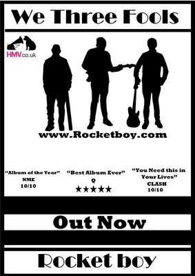
When constructing the magazine advert and digipak, I wanted to reflect this new style, but really did rush their design. What I had during the draft stage was essentially some unrelated artwork there to just look nice, an effect that was drastically reduced thanks to my inability to see that I'd accidentally colour corrected it enough to make it the photos green, a view reflected in the feedback gained from various class members. In order to try and fix everything wrong with it, I redesigned the entire magazine advert whilst retaining the original inspiration for the digipak, opting for the use of black and white photos to avoid any colour problems that may arise from being colour blind again, and getting opinions on what was and wasn't working in term of the colour scheme. The montage of performance photos in the Biffy Clyro album that inspired me was taken to the extreme for the design of the magazine advert, using very similar styled photographs of our own band to create a professional but attractive layout. However, whilst people did praise my final magazine advert, the digipak didn't turn out as well as I would have wanted, which many pointed out to be because of the style of the band that was used to inspire it - the band Biffy Clyro's style wasn't at all like what we had wanted with ours, and yet I had used their style to inspire almost every aspect of my own digipak, resulting in a digipak that just didn't fit the style I was going for. What I learnt from this stage of the coursework and the feedback gained was that it's very important to put as much focus on the consistency in style over all the products, not just focusing on one like I did and neglecting the others.

With the music video, the original plan and final plan differed greatly because of the feedback we gained and the experience we had during early stages of production. As we attempted to meet the deadline of the draft, we were using a combination of narrative shots and performance shots, but came across a lot of problems during the shooting that meant we had a lot of shots left to shoot by the time the deadline came and we weren't able to properly meet it. The feedback we got on that process was that the narrative shots we did have didn't work anyway, and that to avoid problems with the final video we should just use performance shots and avoid having any narrative at all - these comments were from teachers and students alike. What we learnt from this was that keeping things as simple as possible works best, and the more complex the idea the more problems that can arise. The feedback we gained from this draft was invaluable in increasing the quality of our final video.


4. How did you use media technologies in the construction and research, planning and evaluation stages?


Evaluation Question 1

Evaluation question 2

evaluation Question 3

Media Evaluation Question 3

Tuesday, 20 December 2011

Evaluation Question 4

Friday, 9 December 2011

Media Evaluation

How effective is the Combination of Your Main Product and Ancillary Texts?
Between the digipak and the magazine advert i think I have made them in the same branding, I think this because I have used the same colours throughout the whole digipak and advert and the same font with the album name and band name, the reason why I have done this is because it connects the two pieces of work and people will be able to tell that it is We Three Fools stuff. But the biggest branding I have in my work is the silhouette piece of the band member on the front cover of the album and the front of the magazine advert.  Though two silhouettes are the recognisable symbol of We Three Fools and as soon as people will see them they will know what band it is. The music video connects with the two ancillary projects because in the silhouettes you can tell who is who when you look at them. Another way you can tell is that behind the CD is the instruments of the band members put together so you know what instruments they are using and hopefully you will know it We Three Fools because we will be the only band doing it at the time. I think the genre of the video connects well with the digipak because of the softness of the song and how the three members look inside the digipak, but one floor I will say is that the front cover of the digipak would look better if I had swooped it around with the one of the magazine advert, this is because it looks a bit to rocky compared to the rest of the it.

Media Evaluation

What have you learned from your audience feedback?
Music Video
"Setting is a bit 'school like'. Frontman looks beautiful. Ugly bass player. Lip sync bit rough in places. Some good framing. Bass fits with music. Without gaps would be a 7. - 6 / 10"
The setting In the music video look like a school location because its was done in the drama studio. At first we used the e-learning centre but we got told that it doesn’t look like they would film a music video there, so we tried to get the stage which would make more sense when recording a music video but the panto had book it out for the next two weeks so we went for the next best option which was the drama studio and I think it looked better than the e-learning centre. The gaps in the video happened over the weekend because we got a little extra time to do it because the laptop was being really slow and we had to get the bus home. But when we finished all of the editing and rendering then we noticed that it had gaps because the two clips didn’t last as long as we thought and by that time we didn’t have enough time to do it all again considering we already had an extension.


"Setting is simple, could've been better but understandable. Mise en scene with costume and setting works well, fairly simple. Nothing too bright and colourful. Lip syncing is mainly good, couple of times where slightly out of sync but overall good. Timing with keyboard and bass is good. Bass player needs a haircut. Singer needs a shave. Panning is very effective - gives video a bit of an edge. If it weren't for gaps, would be class. - 6 / 10"

The setting again was a last minute thing because of the stage being booked all the time. The only things I thought was wrong with the mise en scene was all the school equipment in the background e.g. chairs and posters. Some of the singing was done without the music because one of the band members had to go early and we had to get his shots done as quickly as we could. I did suggest to the bass player about shaving his head for him but he wasn’t having it, credit to dale with the panning matching the pace of the music.

"Styling / choice of artists is good. Movement of shots work well. Seems to be in sync with instruments. Simple mise-en-scene works well. - 7 / 10"
We tried to keep the costumes all similar and quite smart because it goes with the slow music of the video. Dale did very well to get the number of different shots in the video and we used Mr Fords advice and made the band members connect more by looking at each other during the video. I only really had one note to play on the keyboard but in the original music video the is a piano and a keyboard which in are video make some of my syncing look a little out.
"A good variety of shots. Simplistic idea works well. Could include slightly more action. Characters look the part. - 5 / 10"
We tried to put in a story as well as a performance but it looked better without one and it was much simpler to do for us. The reason why there is not a lot of action because in the original video there is just a performance but if there was more action in it, it would go against the genre of the music and the slowness. We had been told by a couple of people that it looks a proper band because Pats looks like a front man, I look like a keyboard or drummer and harry looks like a guitarist and not a singer.
Digipak
Though the colours went well together, simple but it works and I like how you have put Pat on the back cover”
I though the same way you can’t go wrong with black and white and Mr Ford was telling me to make simple and I looked at Linkin Park album which I like and it was simple so thought I would couple. And I used Pat on the back cover because his band leader and it would be better for advertisement if I put him on the back cover.
“Liked the picture behind the cd, the background of one of the pictures with the fire escape is a bit out of location”
The picture behind the cd is the two guitars and the keyboard put together on Photoshop like a skull and cross bow, I did this just trying to find something to put on my advert and ended putting it on my digipak behind the CD. The fire escape in the background is in the e-learning which is were we did are first photo shoot and I wanted a picture of all of us separate.
Advert
“Looks there is something missing in it”
I thought the same thing but I was running out of time and I was just trying to fill the space but the main thing I liked about it was the silhouette on the front.
“The silhouette links well with the digipak and video makes it all connect”
I tried to make them all have the same branding so they are all recognisable to the public that they are We Three Fools merchandise. it didn’t take me long to do on Photoshop either which I thought was the best thing about it.

Media Evaluation

How did you use media technologies in the construction and research, planning and evaluation stages?
Twitter
We made them a twitter account so that they could come across as a real band and so they could update on what they were doing. For example I put that they were really looking forward to recording for the final time. Keeping the followers that we had updated on what we were doing.

Blogger
The blogger I used to post all my information about my research, inspiration etc.so I could come back and look at it whenever I want, mainly when we are evaluating are work and you need to referee back to it.

YouTube
I used YouTube at the start of the course work to find what videos that I like and could be a possible contender of the video we were going to do. However when we found what song we were going to do i used YouTube to look at the video to learn what the location looks like and because I was preforming in the video I had to also look at how the guy is playing the keyboard so I could get it right when I play in the video.

Video camera
The video camera is obvious we used it for filming the video and taking pictures of shots we could use on are digipak and magazine advert.

Phone
The only time I used my phone is texting dale what’s days we are going to film and what is happening with pat and harry.
IPod
The time I used my iPod is listening to the song to help Pat get the vocals right when singing and when the keyboard comes in at the start because it a long pause and I needed to time it when it came in.

After effects
We used this editing software to edit are video but it wasn’t are first choose, because we used it last year we knew that it takes really long to render and edit and Miss Sutton told us that it is more suited to pc rather than laptops which is what we did are editing off. So Dale tried to get adobe premiere but it wouldn’t support the file type that we were using so we had to back to After Effect’s.

Photoshop
I used Photoshop when doing my magazine advert and digipak which I found quite hard because I did a film last year and not a magazine so I had to learn most of it from scratch.  Luckily Dale was here to help me when I needed it but I got the hang of it in the end.


Media Evaluation

                                                         
In what ways does your media product use, develop or challenge forms and conventions of real media products?


When doing my digipak I had three different inspirations that I was going to follow theses were NWAs greatest hit, the Ramones and Linkin Park.


What I liked about theses is they are all black and white which is very simple but effective. For NWAs I like the whole black boarder lines around the edge of the cover, what I also took from this is sectioning off the band name and the album name which I did in my draft of the digipak but got told that it would look better in the advert so I changed the two around.
With the Ramones album cover I thought I could go for something like this but then we decided to change the numbers of members in are band because of the lack of people wanting to do it for us, so that idea went out the window and I tried it with three members but it didn’t look right, so I moved onto the next one.

The Linkin Park album cover was probably the most influential because it gave me the idea of the silhouette, which I thought would look good but the only risk I was taking was if it looked good with three members than 6 like in Linkin Park. When I took the pictures that I was going to turn into the silhouette I made a list of poses that they could do but I decided to have them holding their instruments rather than just posing like in the Linkin Park album cover.

Taking the majority of my ideas from famous album cover and only a couple of my own for the digipak made it easier to picture what my front cover was going to look like which was good to have early because your front cover is what will be selling your album and to have an early picture made it less stressful.

Originally I was thinking of having a rocket on my front cover to go with the album name “Rocket Boy” but I was struggling to make my mind up on what kind of rocket to have, and after a word with Mr Ford and Dale I scraped that idea for the good.
This is what my final digipak came out like, simple but effective I thought.


Unlike the digipak my advert was all me, I had to come up with all the idea on it. However I did try to
make sure that the branding is the same in the digipak and advert so people could tell that they are the same band and album. I did this by keeping the fonts the same and the silhouette idea for it. The only research I did for this was seeing if Linkin Park had a magazine advert that would be slightly the same as the album cover but I couldn’t find one. So that’s why I found it difficult to come up with an idea because of the lack of research I put in for the magazine advert which is why I didn’t  rate it at all.

When we were first trying to come up with ideas of the song and kind of video that we were going to do I thought that I would try and analyse the video and songs that I liked. For example Rockstar by Nickelback I thought is a very entertaining song but when we choose the song it wasn’t the type for the slowness of Lippy Kids.
I also looked at an Eminem video Fast Lane knowing that the genre wasn’t what we were going to do but though I would analyse it anyway.  It did have some good ideas that I thought about doing for instance the animation that appear to link with the lyrics which I think is very cleaver.
As the music video went I thought it ended ok but thought we could have done better. However dale chooses the song we were going to do and we were going to have a half would be telling a story and the other half a performance. The story would be about a group of mates and how they are all hanging out together but one of them gets into a university and has to leave his friends. But in the draft after some advise from Mr Ford we decided to just do a performance and no story, so having changing it we had to look more of the original video for are song Lippy Kids.

Thursday, 8 December 2011

Dale's Evaluation Draft

1.) In what ways does your media product use, develop or challenge forms and conventions of real media products?

Currently only got a plan for the things I'll talk about with this, and these notes will eventually be put into the form of a video (maybe).


Digipak and magazine advert: talk about the inspirations (in particular Biffy Clyro's 'Live at Wembley') and talk about the use of the rule of three to help the brand as well as conform to conventios of the good-looking magazine adverts in the research stage (in particular The Verve's 'Love is Noise').

Music Video: talk about the videos of Death Cab for Cutie and Elbow, and the way that you conformed to the elements of their performance videos and how they inspired you. In particular, the live recorded version of Death Cab For Cutie's 'Bixby Canyon Bridge' and Elbow's 'Lippy Kids'.

Notes: criticise the choice of inspiration for digipak and the name's style in comparison to what you've constructed - wild vs mature, which was an accident.


2.) How effective is the combination of your main product and ancillary texts?


3.) What have you learned from your audience feedback?

Video
The feedback we got from the class was generally positive, and we were pretty glad to get comments on the bad stuff in the video too. For some reason a lot of people avoided saying what they thought was bad but still gave us a low score, which is what annoyed us most of all. What we did find out from the in-class feedback though was that whilst we thought the lipsyncing and instrument synchronisation was good for the most part, others noticed it being off quite a bit, in particular the keyboard playing. The variety of shots we used was also seen as positive, and that the mise-en-scene though simplistic worked pretty well – this was surprising, as I thought the video was pretty plain and dull compared to a lot of other people’s.  The outfits in particular were complimented as fitting the style of music, but something me and Tom noticed was that the lead singer (Pat) shouldn’t have worked very well as his appearance didn’t really match the voice of the singer in the song – Harry (the guitarist) would have been better. The location was also noted by others to be too school-like, probably because of the objects in the background, but it was a better location than we originally chose in the draft (which we changed after some feedback from the teachers that it was, again, too school-like).
What we learnt from this feedback is that when filming, we really should’ve focused more on improving the instrument’s syncing to the music, as we seemed to have focused so much on the lipsyncing that we didn’t take notice of Tom’s off-beat keyboard playing. We should have also planned ahead of time to avoid using an area filled with school equipment, as we were planning to use the main hall but unfortunately that was booked solid for the last few weeks of filming thanks to the pantomime and PE exams.

Digipak and Magazine Advert
I also received some feedback from the class on the ancillary texts, and was happy to get compliments on the magazine advert in particular. I was pretty unhappy to not get any criticism over certain parts of it, for example the logos along the bottom – they could have potentially done with some identification as to what they were, for example the icons for where you can buy it weren’t really too clear on what they were there for, and having them in such a non-symmetrical way on the page just feels bad to look at (3 on the left with 1 icon on the right). People did give compliments on the professional and mature nature of the content on the page however, which is what I was aiming for and was therefore happy to hear.
The digipak got some positive feedback too, for example the two-panels of images on the front was complimented as well as the contents on the back cover. What was noted though was that the montage of photos didn’t really seem to fit, and that the page with the ‘credits’ on seemed too out of place, which I totally agree with. In the future, what I won’t do is base the design on a band’s album that is completely unlike the style I’m aiming for – in this case Biffy Clyro’s ‘Live at Wembley’ album. After comparing the album design to the magazine advert, I noticed that the red changed the tone of the work entirely and definitely didn’t work very well in conjunction with the magazine advert’s minimalistic colour scheme. What people also noted was that there’s very little information on the back next to the barcode where would otherwise be information such as copyright info, etc., which is something I would definitely aim to sort out in the future. The spacing on the photographs on the back was also off, and the disk tray didn’t really fit well with the rest – some people mentioned that the design didn’t feel very even, as some pages were cluttered with information and yet others (like the disk tray) were almost entirely empty, comments that I completely agree with.


4.) How did you use media technologies in the construction and research, planning and evaluation stages?


Video Feedback

Uploaded for Tom to look at:

"Lots of varied shots; actors look into the camera sometimes; lip syncing is in time; shots with people in foreground and background look professional; sometimes looks awkward - 7 / 10"

"Some shots are missing but the ones that you chose are good because they suit the type of song. Pat and the other band members really suit the genre. - 7 / 10"

"Shots are good and varied - slow tracking looks good too. All wearing shirts + match, which is good. Sync is good. A different location amy have been better, but it's hard to find. Looks unfinished. - 7 / 10"

"Good use of instruments and miming is in time. Variet of shots. All in same location. - 7 / 10"

"Music matches visuals well. Lip syncing is good. Good camera shots of guitar. Costumes worked well. - 8 / 10"

"Styling / choice of artists is good. Movement of shots work well. Seems to be in sync with instruments. Simple mise-en-scene works well. - 7 / 10"

"Setting is simple, could've been better but understandable. Mise en scene with costume and setting works well, fairly simple. Nothing too bright and colourful. Lip syncing is mainly good, couple of times where slightly out of sync but oerall good. Timing with keyboard and bass is good. Bass player needs a haircut. Singer needs a shave. Panning is very effective - gives video a bit of an edge. If it weren't for gaps, would be class. - 6 / 10"

"Good variety of shots. Lighting is quite grey. Mise-en-scene - good style / image. Good lip syncing and timing with instruments. Music doesn't quite fit with the chosen location. - 7 / 10"

"It looks very obviously like a school. The Lighting gives a very great, uncandesant look. I like the camera movement, the panning works really well. Shots from the back left of Harry work really well but some of Pat's shots cut out Harry. - 6 / 10"

"Good quality camera. Like the simplicity. Good variety of shots used. Song seems pretty hard to lipsync to. Characters look authentic. -  5 / 10"

"A good variety of shots. Simplistic idea works well. Could include slightly more action. Characters look the part. - 5 / 10"

"Good lip syncing, but slightly out of time. Good use of instruments. Panning shots look good and fit with the pace of the song. - 7 / 10"

"Good variety of shots. Lipsyncing is good and well timed. I like how the pace of the shots reflects the pace of the music. Note sure about the location though... - 7 / 10"

"Setting is a bit 'school like'. Frontman looks beautiful. Ugly bass player. Lip sync bit rough in places. Some good framing. Bass fits with music. Without gaps would be a 7. - 6 / 10"