How effective is the Combination of Your Main Product and Ancillary Texts?
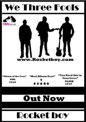
Between the digipak and the magazine advert i think I have made them in the same branding, I think this because I have used the same colours throughout the whole digipak and advert and the same font with the album name and band name, the reason why I have done this is because it connects the two pieces of work and people will be able to tell that it is We Three Fools stuff. But the biggest branding I have in my work is the silhouette piece of the band member on the front cover of the album and the front of the magazine advert. Though two silhouettes are the recognisable symbol of We Three Fools and as soon as people will see them they will know what band it is. The music video connects with the two ancillary projects because in the silhouettes you can tell who is who when you look at them. Another way you can tell is that behind the CD is the instruments of the band members put together so you know what instruments they are using and hopefully you will know it We Three Fools because we will be the only band doing it at the time. I think the genre of the video connects well with the digipak because of the softness of the song and how the three members look inside the digipak, but one floor I will say is that the front cover of the digipak would look better if I had swooped it around with the one of the magazine advert, this is because it looks a bit to rocky compared to the rest of the it.


No comments:
Post a Comment