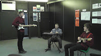
Saturday, 26 November 2011

Final Music Video


There are a lot of problems, the least of which are that we didn't notice until it was too late that people kept looking into the camera, and that in post-production a few of the videos just didn't feel like being useable (visual problems, etc.) which lead to use having to leave black spaces. Those shots that are completely still don't really mix well with the panning shots either, and really we could have done with changing that, especially seeing as the panning was added in post for a few of the shots anyway (compensating for my jittery tripod by zooming out during filming).

Not too happy with the way this turned out. Also, the aspect ratio is weird.

Thursday, 24 November 2011

Filming
The Good and the Bad


On Tuesday we did the filming of the music video in the drama room after school, as the hall has been booked solid thanks to exams and pantomime rehearsals, and the drama room is the only other place that seems appropriate. Also, rather than going in the corner of the room as the previous locations have all been, we decided to clear out the center of the room and film there instead, distancing the action from the wall decorations as much as possible and making it seem like a much more open area, as well as allowing us to get certain shots that would have been harder with those things called walls in the way.

During the filming, it went pretty smoothly, but it took longer than we had anticipated and Pat had to leave before we could finish the storyboard,  no matter the shot list. Looking over the storyboard today though, it seems we actually filmed a lot more than we thought - the filming we did is a good 30 or so shots from the storyboard, which takes up just under 3 minutes, which in the editing process tonight we can change the song to fade at that point instead (which is actually a nice ending to it, if not as subtle as the first cut). Tonight I'll be grabbing a shot of an appropriate looking building to use at the end and give a definitive end to it through the use of that shot.

Despite our best efforts to move chairs out of the way of the shots, because I rushed the filming there are a couple that still have them in, most obviously one where the camera tilts from Tom to Pat, and the camera is pointed in the direction of where the bulk of the chairs were put. It would have made more sense to stack them and keep them in a blind spot, but I'm an idiot.

Whilst the shoot didn't go quite as well as I thought it would, it didn't go as bad as it could have gone either, and hopefully the final video isn't off in terms of pacing or the like. Rather than the original plan of just drawing a storyboard and then improvising during post-production as to the actual pacing, it looks like we'll have to stick with the storyboard rather rigidly with very few deviations, if any. Hopefully the pacing is okay, but having not had the time to scan and make an animatic of the storyboard this'll be hard to tell - this was a problem with the first storyboard where we underestimated the length of seconds and so every shot was just too quick, but we hope that won't be a problem this time as the length of the shots has been greatly increased: where the original storyboard had around 100 shots, this one has just over 40, trying to keep with the slow pace of the song.

I'll upload the new storyboard tonight.

Wednesday, 23 November 2011

Filming 5#

The filming yesterday went ok, but we didn’t manage to finish all of it because Pat had to go a bit early than we thought. However we did get a lot of good shots in of all three band members together and individually, we need to finish filming asap but we are editing and putting it together right now and getting ready to put the rest of the video on.
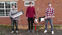
There was a bit of a problem made by DALE LUCK with the tripod. Well I had to sign for it for over night use because Dale “couldn’t find his card”. Then we finished filming and he asked me to hold his keyboard stand as well as my keyboard, so I said yeah but you have to hold the tripod then. We then got to the late bus and I asked him if he had the tripod and he said NO, so he went back to look in the drama room but he couldn’t find it, so we got on the bus and Dale started worrying abut it so I said to Dale we will have a look in the morning, in the morning I got to school before Dale and looked in the drama room and guess what Dale didn’t look properly because it was in the room.


Friday, 18 November 2011

Music Video Draft Feedback Evaluation


When we got the feedback, we weren't expecting anything fantastic - shooting problems, insufficient planning and issues with scheduling stopped us from doing even a quarter of the final music video properly. Mr Ford pointed that out, and said that of we did have we needed to have more connection between the different members of the band - as is, the band members don't seem to acknowledge each other's presence, and so to fix this we plan to be including a moderate amount of shots where they notice each other, very much like the actual music video for the song. We've also been told that the performance shots were incredibly poor, which is fine, and so we plan to have the final video be nothing but performance.

The location of the shot is also being changed, as the E-Learning Centre is obviously out of place, especially with the things on the walls. We were going to use the main hall, but unfortunately the pantomime rehearsals have that booked solid until December (past the deadline), so instead we've opted to use the drama room, which is appropriate enough. A problem we'll come across there is the things on the walls to worry about, which hopefully I could try to edit out but probably won't be able to. It is possible that we could take those things down and replace them after the shoot, if the drama department let us.

Another problem that we seem to have with a band member in particular, Tom Cartwright, is that he seems to focus too much on the keys when playing to the point where he seems fairly robotic - to fix this, we've decided that he should probably be more relaxed in his shots. In addition, to that change, we'll also be including shots that show the instruments being set up (plugging them in, etcetera), and various other shots.

We're hoping that the final shoot goes a lot better this time, but due to scheduling problems - again - we're having to do it on the 22nd, just a few days before the deadline, giving us a very limited amount of time to be editing the video.

Filming 4#

A slight problem for are music video, we had already changed the location to the stage in the hall from the e-learning centre because it looked like a young offenders room. So we thought the hall would make more sense but due to the pant ermine we can’t book it out until Friday which is when the deadline ends. So we had to change the location again to the drama room which is still better than the e-learning but not as good as the stage, so we are due to film hopfully on Tuesday.

Wednesday, 16 November 2011

Magazine Advert


My magazine advert didn’t go as well as planned; I thought that the use of space on it wasn’t as good as I could have made it, this was because I had to change my it a lot from my draft. However I do again like the silhouette approach I took when putting an image of the band onto it.
The font of “WE THREE FOOLS” and “ROCKET BOY” I had to just browse through the fonts on word and think which one was best, lucky I found the font I wasn’t quite early and didn’t have to waste mush time on that. On the “OUT NOW” font I got told to just change it from the other fonts of the “WE THREE FOOLS” and “ROCKET BOY”. To me it feels like there is something missing in between the website and the ratings.


Tuesday, 15 November 2011

Finished Digipak


I was happy the way my finished digipak turned out; I kept my original idea of the digipak but with a couple of changes suggested by the feedback. I also wanted to make sure that I had all three band members on the digipak.
Front Cover
The whole silhouette idea I got was from the Linkin Park album, I love this idea and I am glad I stuck with it; I even took about 6 photos of different positions that they could be in and then mixed them all together to get my favourite one. Miss told me I need to use the rule of three on my front cover which know after I have done it I think works really well.
Back Cover
The back cover I thought had to go with the front cover, so I thought they should both have the same plain white background. I originally had Harry on the back cover because I liked the picture and  it worked well with the lyrics on the other side of it but with some help from the student teacher he said I should have the lead singer on the back to promote him and the album better. So we had to shoot a second photo shoot of the day and get a different shot of Pat to put on the back cover.
Left Cover 1
The left cover is just a picture of me playing the keyboard in the e-learning with the window bars and fire escape in the background with I don’t will work well with the mise en sene.
Left Cover 2
The other left cover is a picture of Harry playing one the bass which was going to be the back cover but for reasons I changed it. I did the two left covers photos together at the very first photo shoot we did.
Back Inside
The back inside is an image of the three instruments used in the band but put together like a skull and swords, I just tried to put something on my poster and came up with this image and thought it would look good behind the cd. All I had to do to make is take a picture of the guitars crossed and then the keyboard and then black them out on photo shop.
Cover Inside
The last cover is just all the credits with a black background and white writing, I was going to put a picture of the whole band together but I tried with both of them and thought the credits one looked better but I did have to add more credits that was there in the first place to make it fit into the page better.

Friday, 11 November 2011

Dale's Ancillary Products
Digipak + Magazine Advert


I think the magazine advert went pretty well - the "collage of band shots" idea came from one of the panels in the Biffy Clyro album "Live At Wembley", and I think it works pretty well.

I tried to stick to the "rule of three" idea that the magazine adverts I looked at used by keeping the band name, album name and other relevant album information within the bottom third of the page and having the montage be mainly in the top two thirds. The main point of focus is the large group photo that lies directly in the center of the top two thirds, and though it looks from a glance to work well I think it could have definitely been shot better.

The logos for the places the album can be bought also could have been placed better on the page, probably centered below the "Out Now" text.

The record label logo would then have to be moved, as being just placed in the bottom right would, and does, look pretty off.

The "Out Now" text also looks a bit out of place, and probably could have done with using a thinner font.


I wasn't too happy with the way the digipak came out. Compared to the magazine advert, it doesn't look... clean enough. The colour scheme was fixed, but it doesn't look quite as minimalistic or attractive as the magazine advert does.

The basic layout was inspired by, like the magazine advert, the Biffy Clyro album 'Live At Wembley', with the combination of a red background with black and white photographs.

The distance between the smaller pictures on the back panel seems too wide, and the photograph on the left cover inside seems a bit out of place for one reason or another, as does the text.

The disk panel seems incredibly out of place, being the plainest panel on the entire digipak, but I'm unsure whether that's appropriate or not considering it's only there to hold the disk.

The only things I think were done pretty well were possibly the front cover (but even that seems off), and the spine for the album. Really I should have spent a lot more time on this.

Thursday, 10 November 2011

Digipak Shots


Digipak Shots


Digipak
Shot list

For mine and Tom's digipaks and magazine adverts, we'll be needing to take quite a few new photographs due to the revised location of the shoot (now being the drama room). Due to difficulties earlier in the week we were forced to push the shoot to Thursday night, the day before the digipak was due, so in order to make it go as fast as possible and give me and Tom enough to work with we made a shot list of the shots we'd be needing to take (below).


FIliming 3#

We have also changed the location of the performance from the e-learning to the main hall on the stage, this is because mise en sence is not the best in the e-learning with the bares on the windows and it makes a bit more sense to do the video performance on a stage.
It didn’t go to well yesterday because Harry forgot his shirt and the bass guitar and Pat turned up late, however hopefully we all should be staying behind tonight after school to get most of the filming done and some final shots for my digipak

Tuesday, 8 November 2011

Improved Shot List

Because of the massive changes that we've made to the plan for the music video (mainly getting rid of the narrative shots and having to increase the amount of performance shots), we decided to write out a shot list to keep track of what we're doing, being a 4 minute long song.

The shot list consists of 72 shots, with shots being listed that may not be used, depending on whether or not we think it's appropriate during the editing process - it's better to have shots we don't need than be missing shots that we want.


Wednesday, 2 November 2011

Draft Ancillary Product
Feedback


Magazine ( 1 / 10 )
"Terrible image, bland colour. Release date and stars need to be smaller. Consider using 3 ratings."

The image was shot at night and for some reason it came out green. I didn't know this until after I'd handed in the draft (being colourblind), so for the final digipak I'll make sure to have better lit and composed pictures and get some advice on what colours I'm using.


Digipak ( 4 / 10 )

"Good layout on front and back cover. Images not strong enough, especially with sepia toned colours. Good font on cover. Mise en scene doesn't work - images need to define it. Barcode too big, needs record label."

Again, didn't realize this was brown or that that the pictures were green, so for the final piece I'm going to use pictures of the band that will be black and white, and I'll be more careful to use red instead of brown, because that's what I thought I was using in the first place. It will use the digipak of Biffy Clyro's 'Live At The Wembley' for inspiration.

Digipak & Advert feed back

Digipak feed back

The first thing about the digipak is that I need to use the rule of three on my cover of the digipak, this is because miss said that the title shouldn’t cover over 1 3rd of the page, so I am going to try and fit it all on one line instead of two.
I have pictures of the two of three band members on the digipak in big and need to put the third one (which is me) because it doesn’t make much sense to have only two of them and not three. This means I need change the left cover and put that on the back inside because the three band members need to be seen other than the instruments they use, which can go behind the cd case.
Need to change the lyrics on the back of the cover because why do I have the lyrics to one song when it’s a album, so what I need to do is either don’t do it at all or put the lyrics on the back of all the songs (which is a no no).
Magazine Advert
I did like my magazine advert however when miss pointed out that it look more like a concert advert than a magazine one I thought the same thing. Instead of having the three instruments on the poster I am going to have the three band members instead to make it look more like a magazine advert than a concert one. I also need to change the fonts on all the writing except “We Three Fools” and “Rocket Boy”, this is so they stand out from all the other writing and people knowing the band and album name is. The date need to be made smaller along with the “Download” and “In store”, finally I need to say where the star rating has came from for example Q.